Freelance
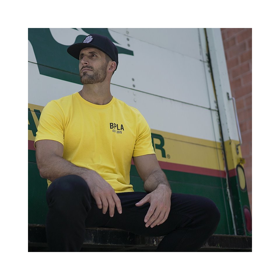
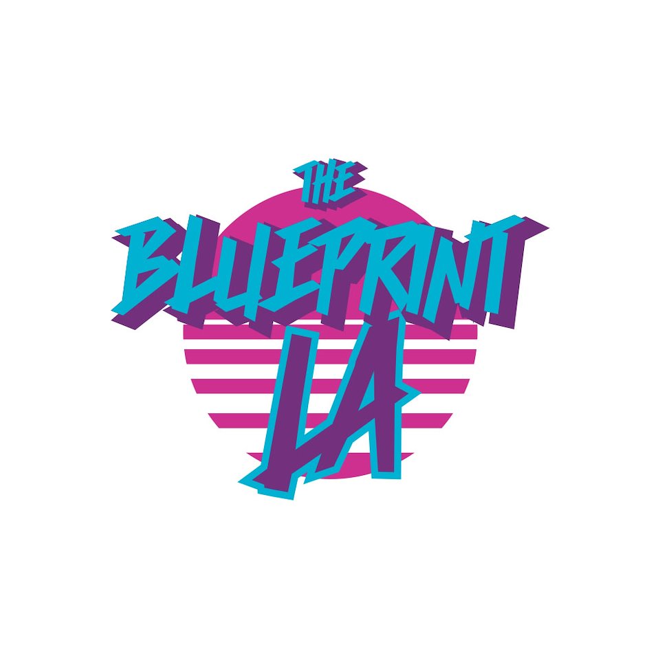
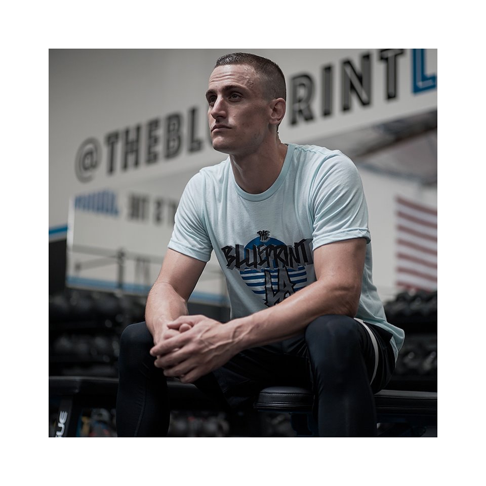
These are graphics that were all designed for BPLA’s Summer 2019 line. The aesthetic of BPLA is a very clean athletic feel that can also be worn out at night. We took from the feeling of relaxed and fun vibe of the beach community and surf culture since BPLA is located in the South Bay.
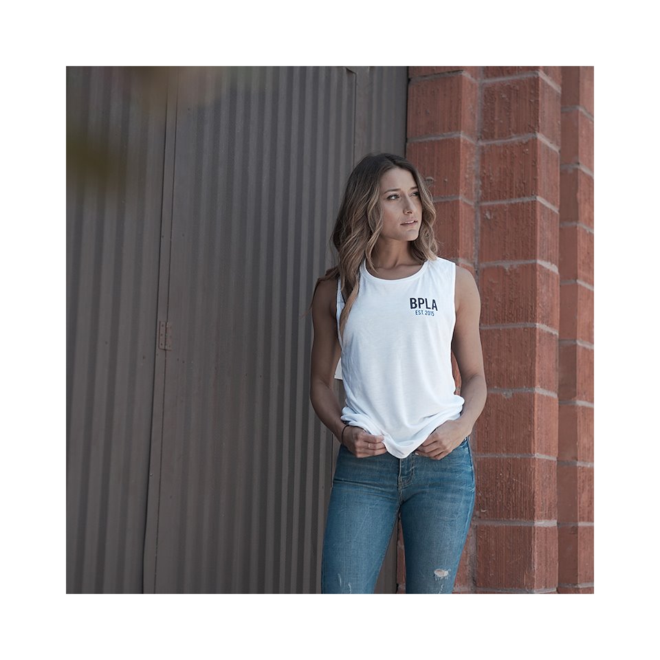
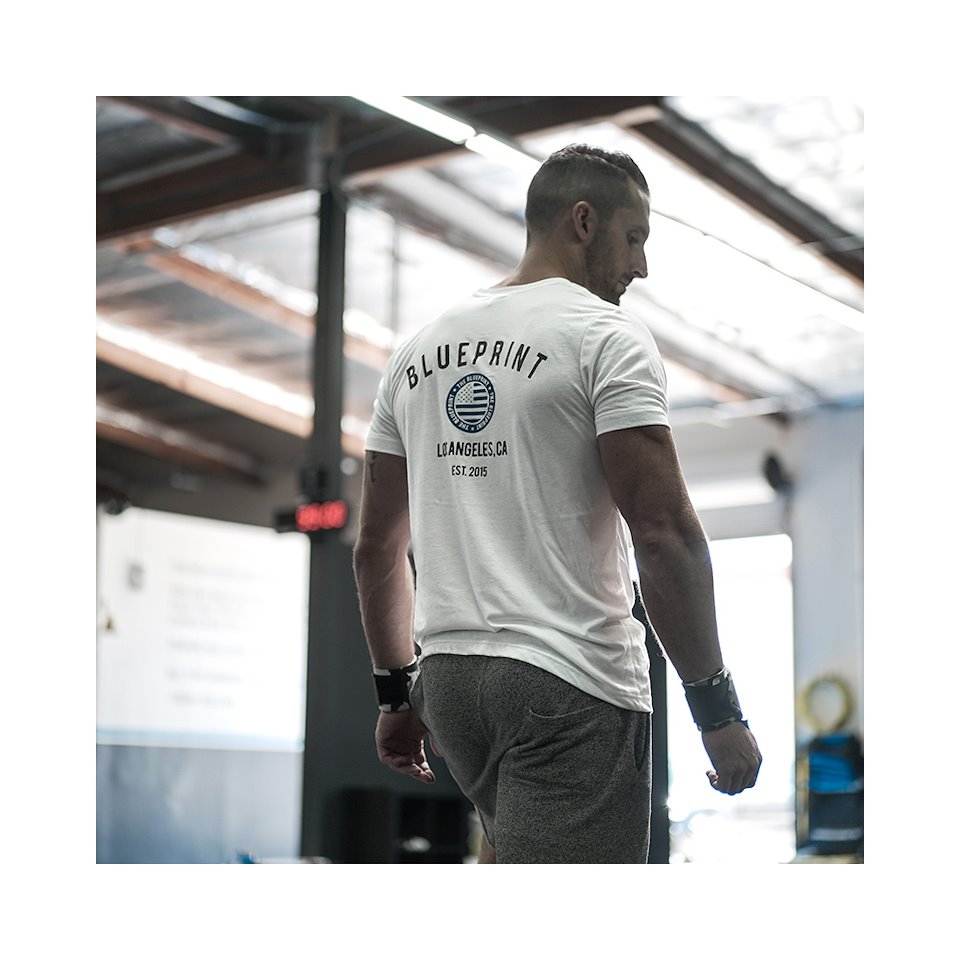
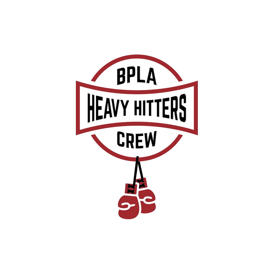
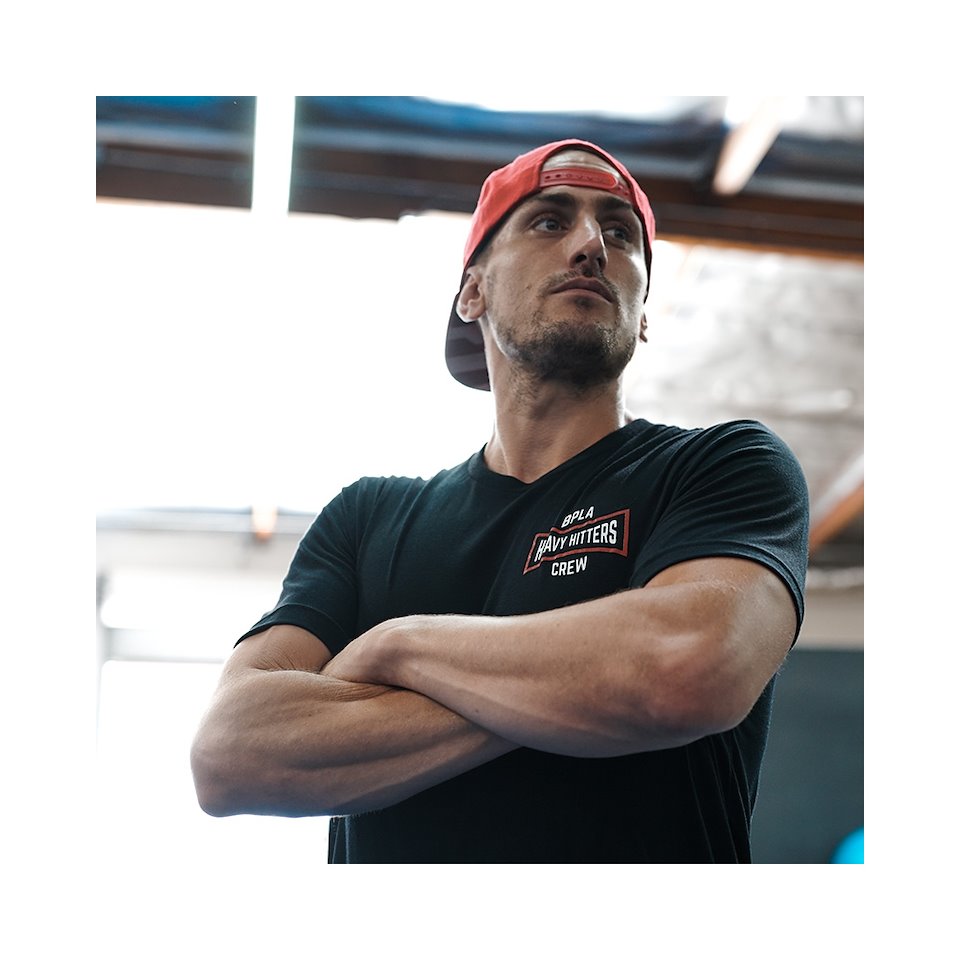
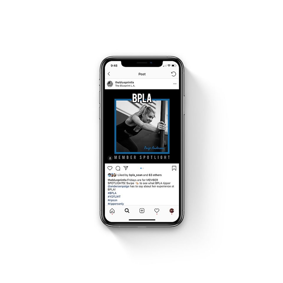
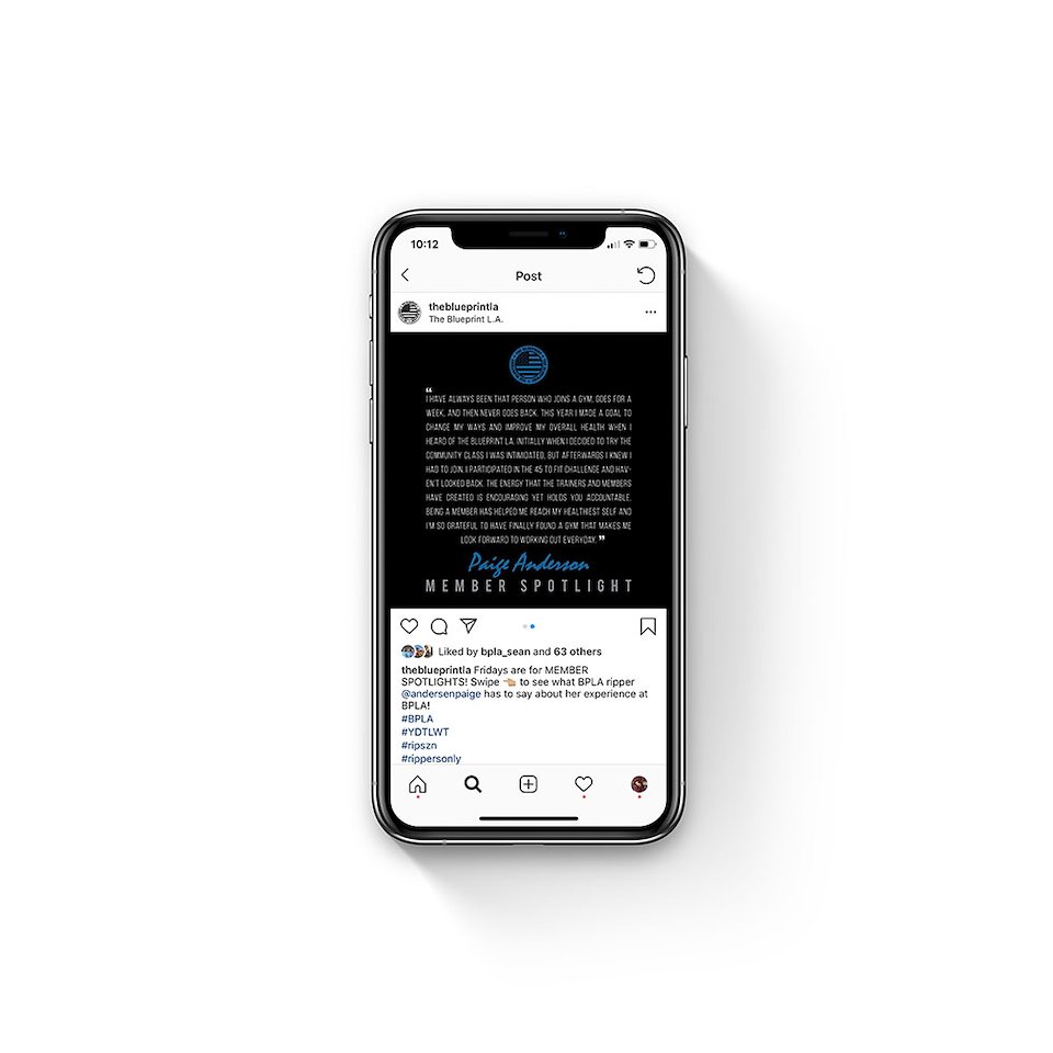
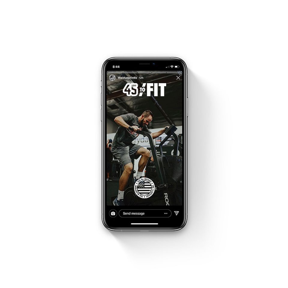
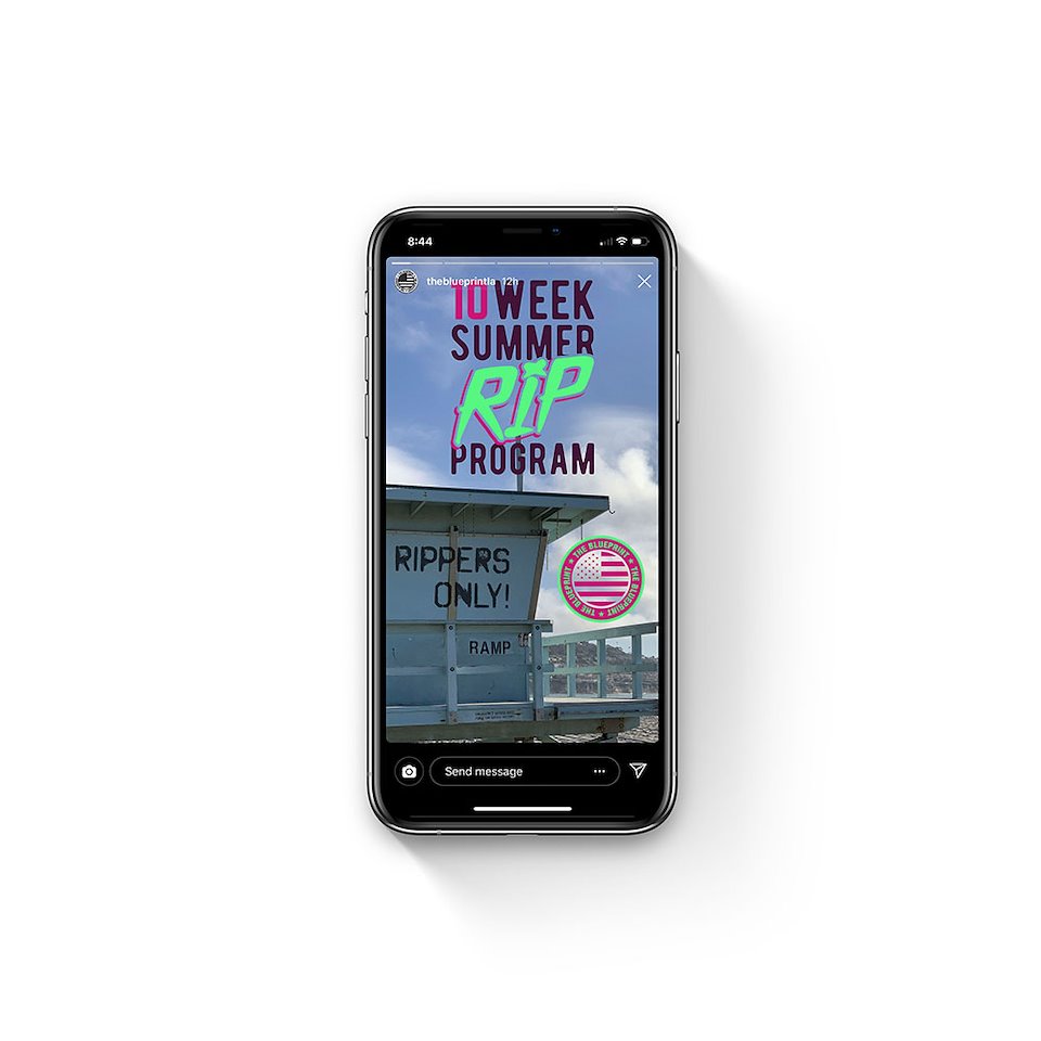
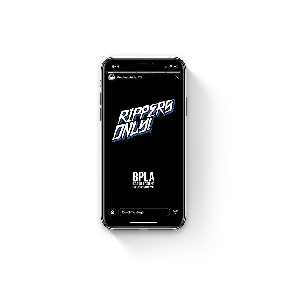
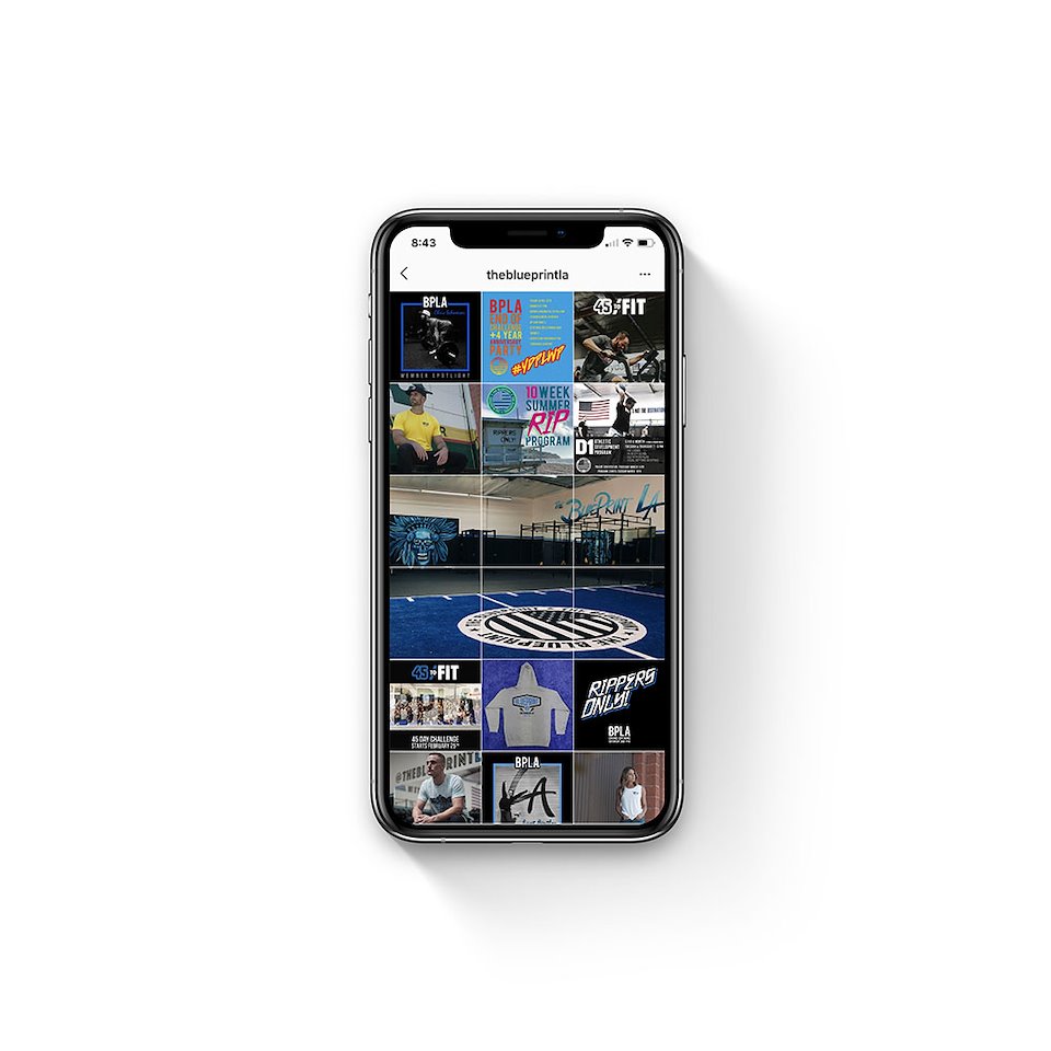
These are social media posts created for BPLA. These range from anything from instagram posts for Member Spotlights to advertisements for upcoming events.
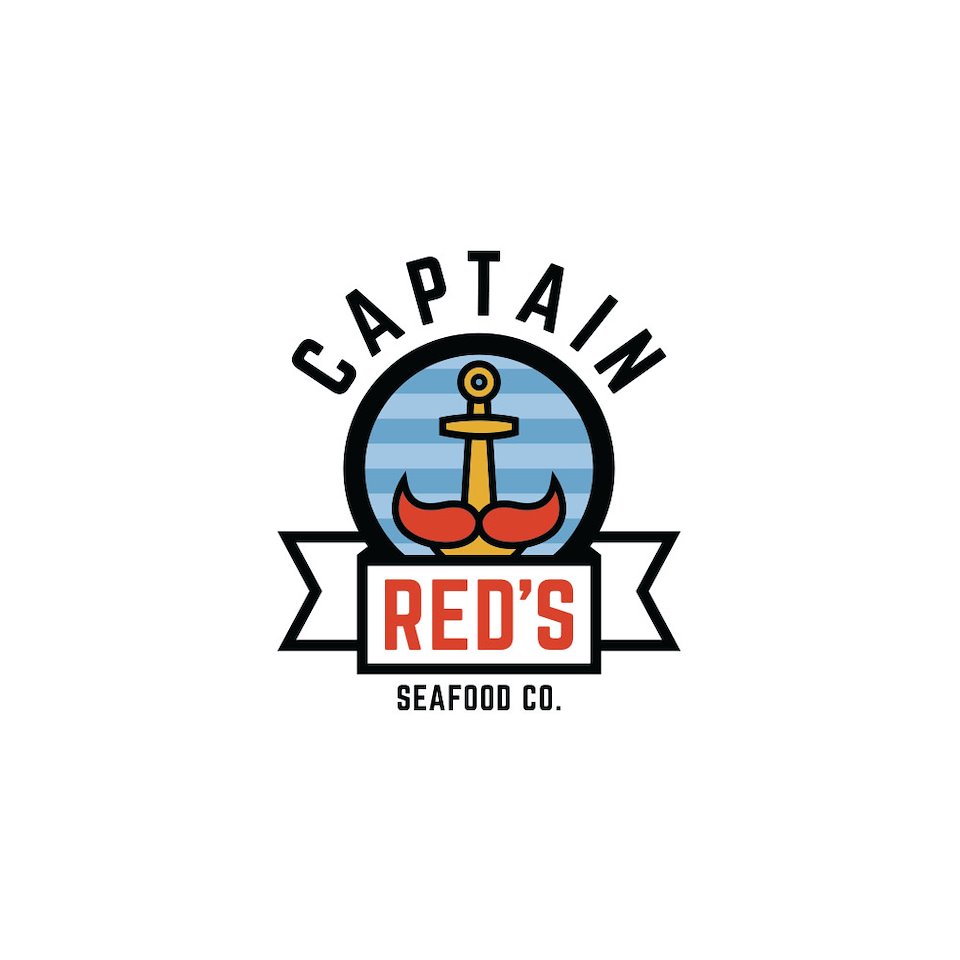
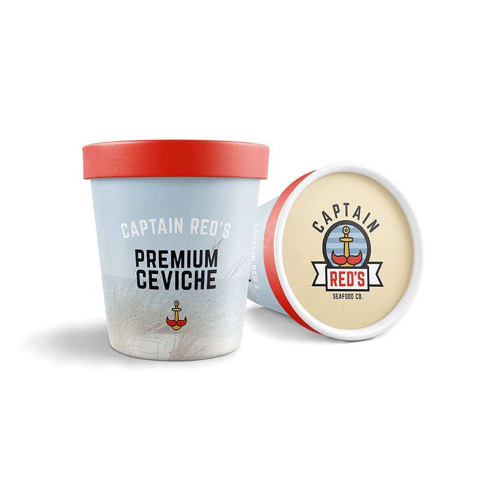
A redesign of an existing logo for a seafood company that is family owned and operated. The business went away for around a decade but now father and son wanted to get it restarted and tap into the original design of the sailor with the red beard but get away from the generic fisherman as the logo. We took the anchor and added the red mustache to give it a nod to the past while modernizing and cleaning up the overall feel.
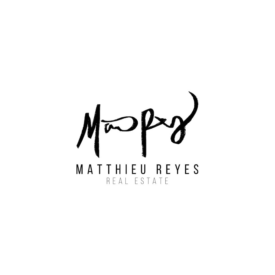
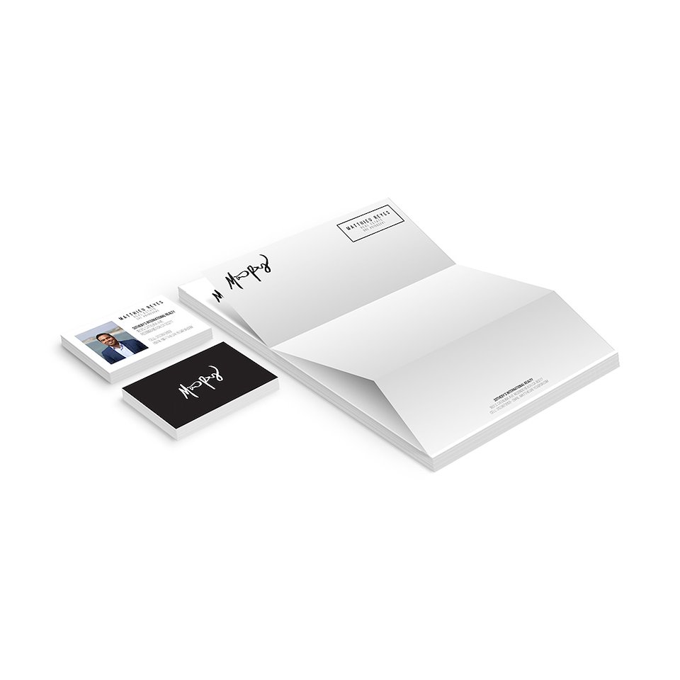
This logo was designed for a local real estate agent. While he is a younger agent he still wanted to appeal to older clientele as well so we tried to come up with a modern yet timeless logo. We also used the idea of a signature because your signature is your word and being trust worthy and honest is a big thing to the client when it comes to making such a massive life changing decision.
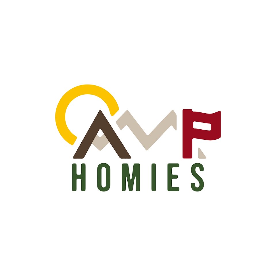
Camp Homies is a group of friends that have established a community of outdoor loving and adventure seeking people. When they came to me for a logo they wanted something that gave the feeling of the outdoors while also being modern and clean. We took the landscape and made it into the actual font so the art for their community is also their logo.
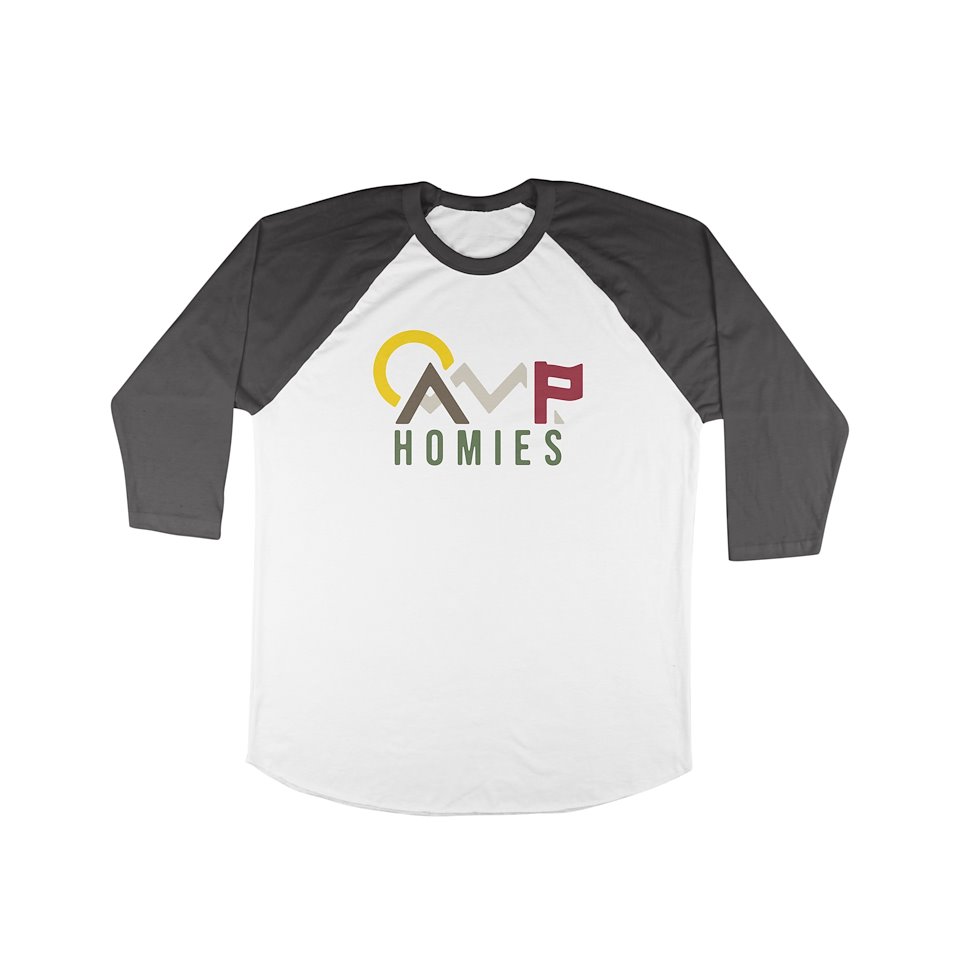
Camp Homies is a group of friends that have established a community of outdoor loving and adventure seeking people. When they came to me for a logo they wanted something that gave the feeling of the outdoors while also being modern and clean. We took the landscape and made it into the actual font so the art for their community is also their logo.
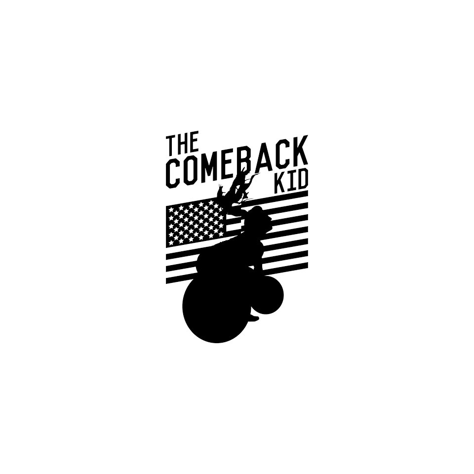
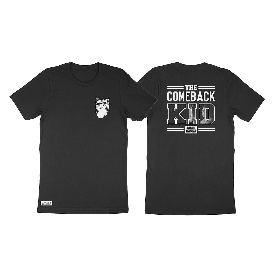
The Comeback Kid was a campaign I helped create and launch for athlete Jamie Hagiya on her road to recovery from a torn Achilles. This is the logo and shirt that was designed but there was also a social media campaign that lead up to Jamie’s full recovery.